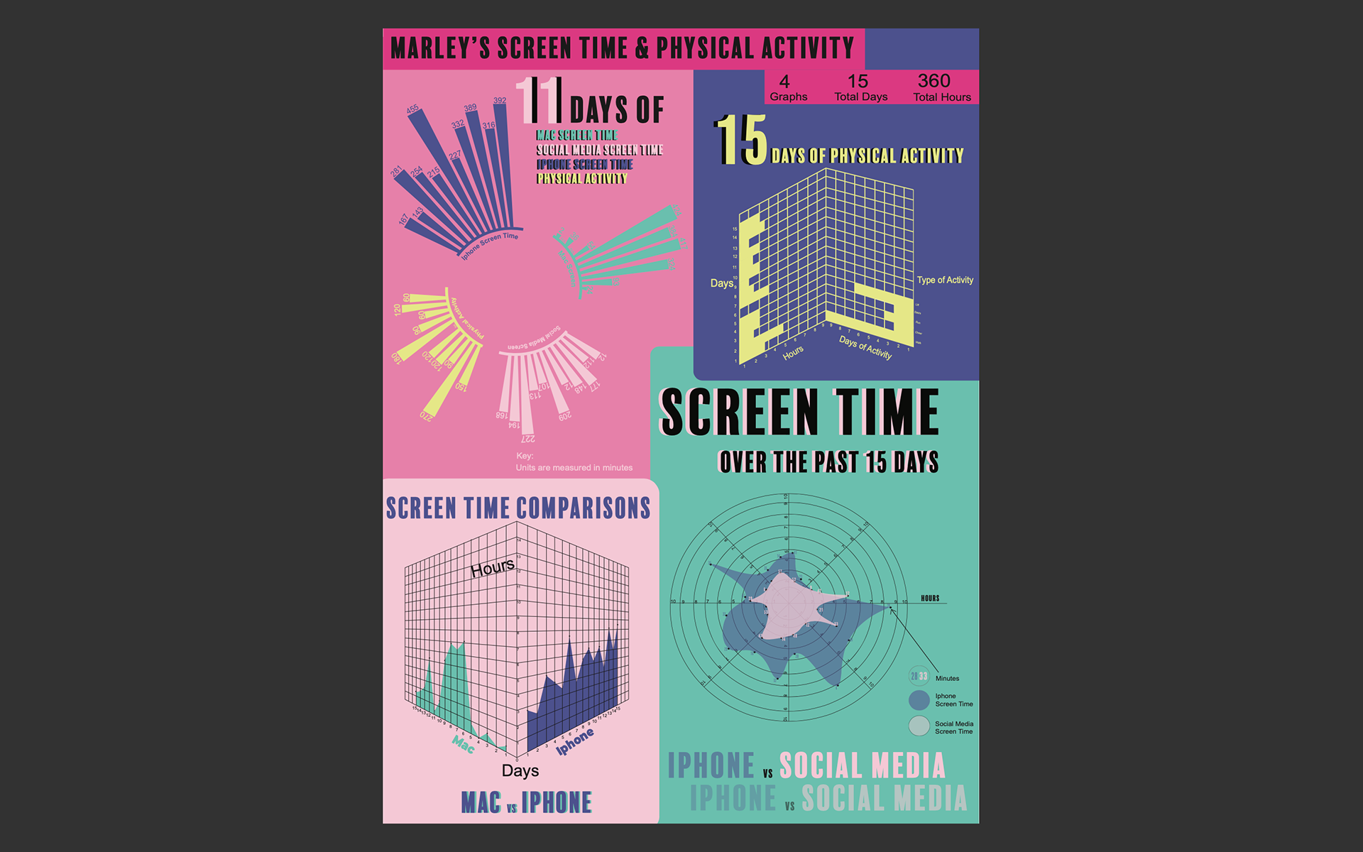
Defining the Project: For this project, I was asked to collect data about my everyday life. I chose to track my iPhone screen time, my Mac screen time, my social media screen time, and my physical activity. I tracked my screen time and physical activity for fifteen consecutive days. After I collected my data I was asked to construct an 18x24 inch artboard that contained a graph or graphs of my data that was visually interesting and informative.
Objective: For this project, my goal was to experiment with different types of graphs and observe how each graph tells a different story. I wanted to design graphs that were visually accurate, informative, and intriguing.
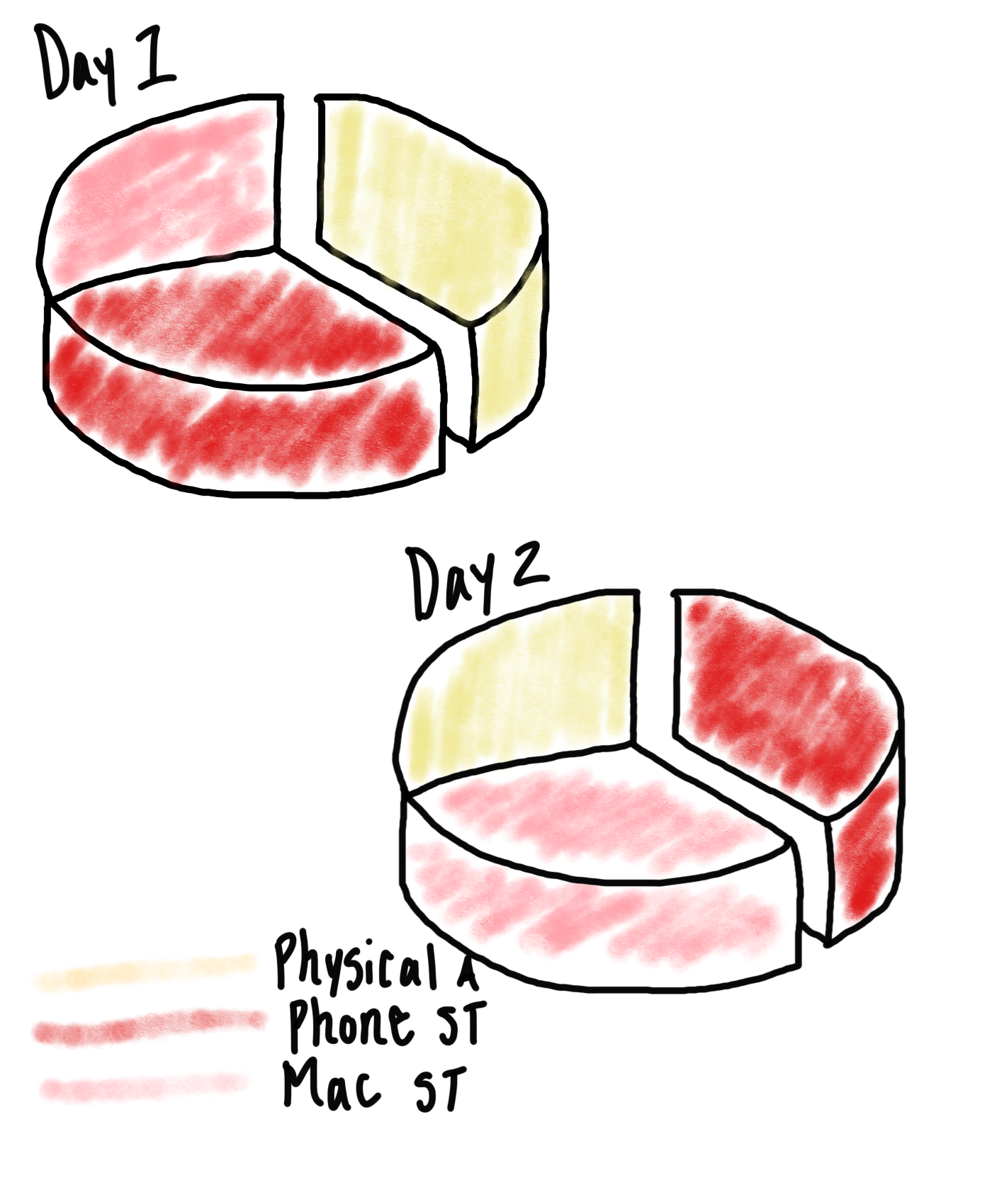
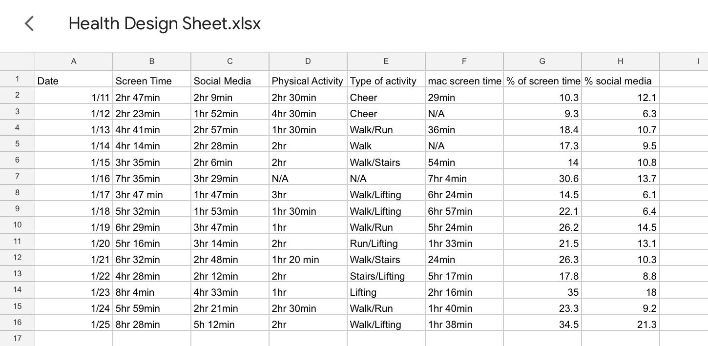
Data Points: iPhone screen time = is tracked on my phone in my settings
Mac screen time = is tracked on my Mac in my settings
Social media screen time = is tracked on my phone in my settings
Physical activity = I tracked my hours and the type of physical activity I did each day
Methodology: I used my iPhone/Mac settings and I also logged my data manually
Timeline: For my screen time collection I looked at my settings before I went to bed every night and logged the times on Google Sheets. For my physical activity, I would keep track of the time I entered the gym from the time I left the gym to record my activity. At the end of the day, I would also include my physical activity data collection in the Google Sheet.
Initial Observations:
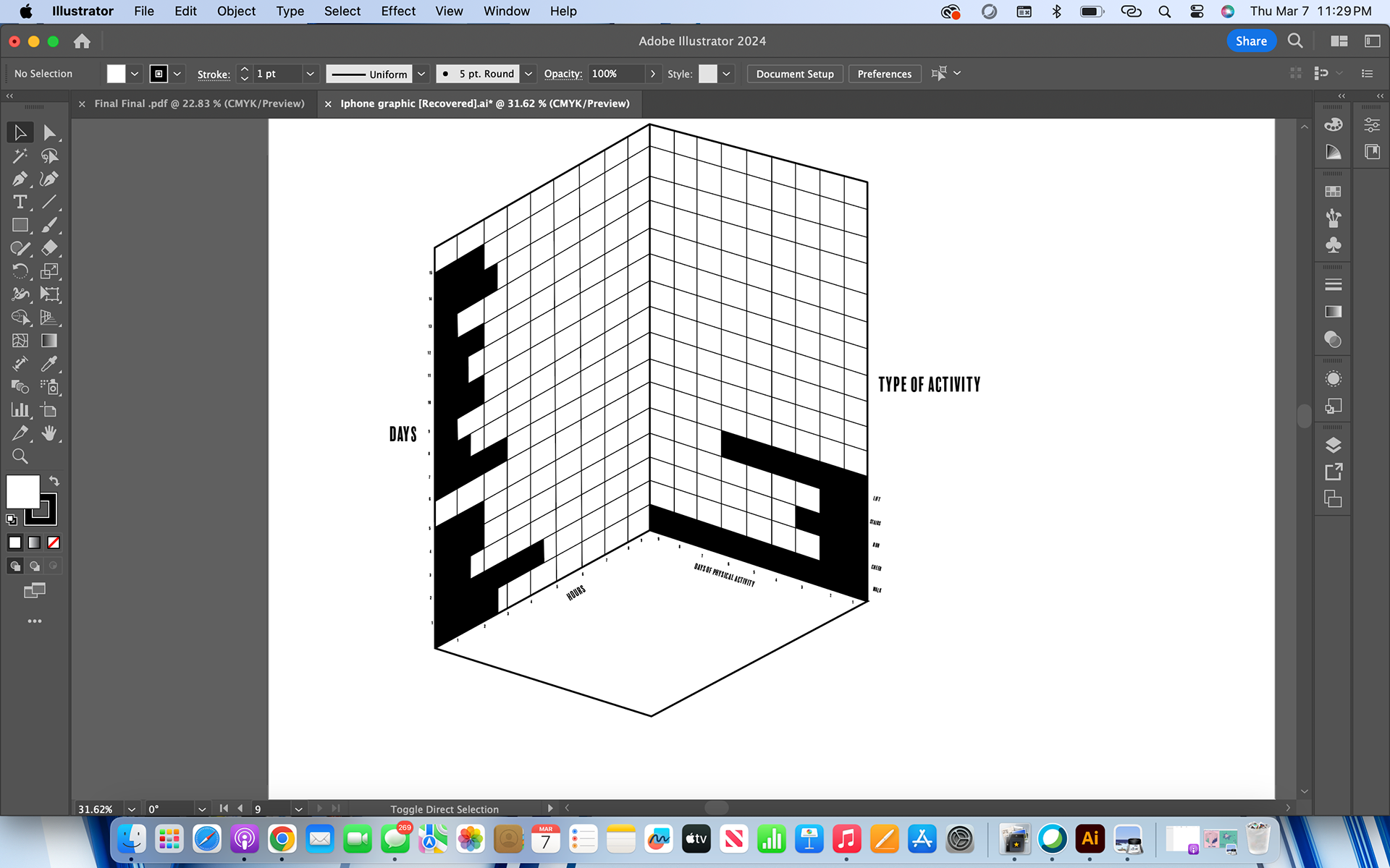
-My overall average screen time increased as I got further into the 15 days of tracking
-I spent less time on my iPhone and Mac when most of my physical activity was cheer
-The device that receives the most screen time between my Mac and my iPhone is my iPhone
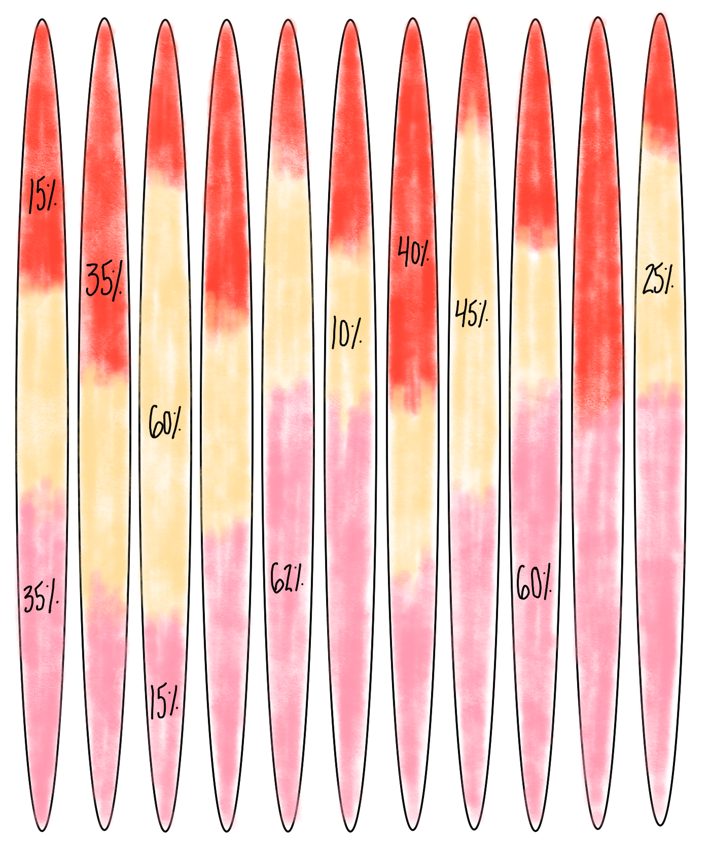
-My Mac screen time is not consistent, I will have days where I'll spend up to seven hours on my Mac and some days where I will only spend an hour
Tools & Techniques: Some tools and techniques that I used to help me navigate through this project were Google Sheets, Raw Graphs, lots of hand sketches, lots of experimentation with different graphs, and lots of comparing. I found it very helpful to also find the percentage of screen time used within that day compared to 24 hours. The percentage method helped me compare and contrast all of the different numbers.
Findings
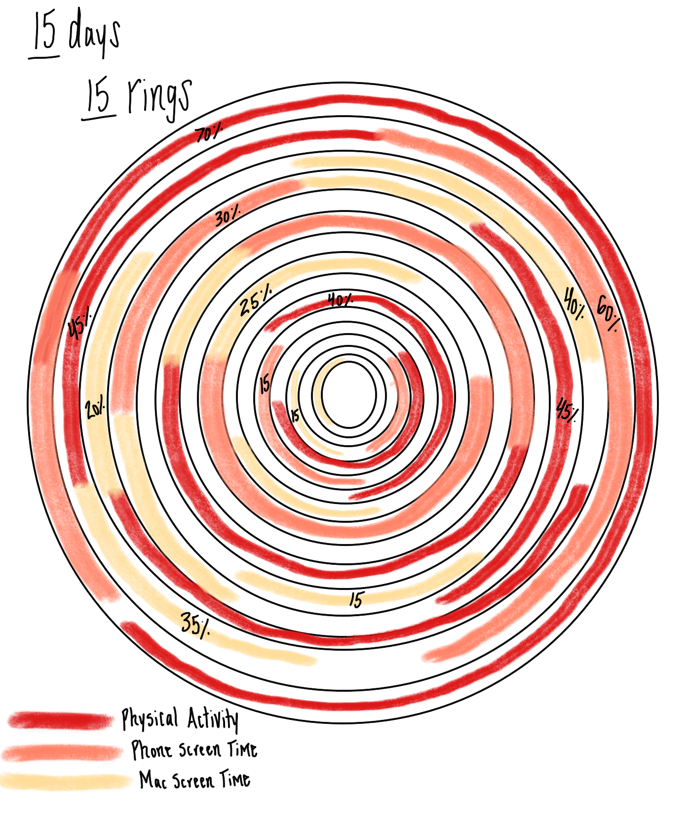
-On day number two I was the most active and the type of activity I was doing was cheer
-9 of the 15 days I chose to incorporate walking into my type of physical activity
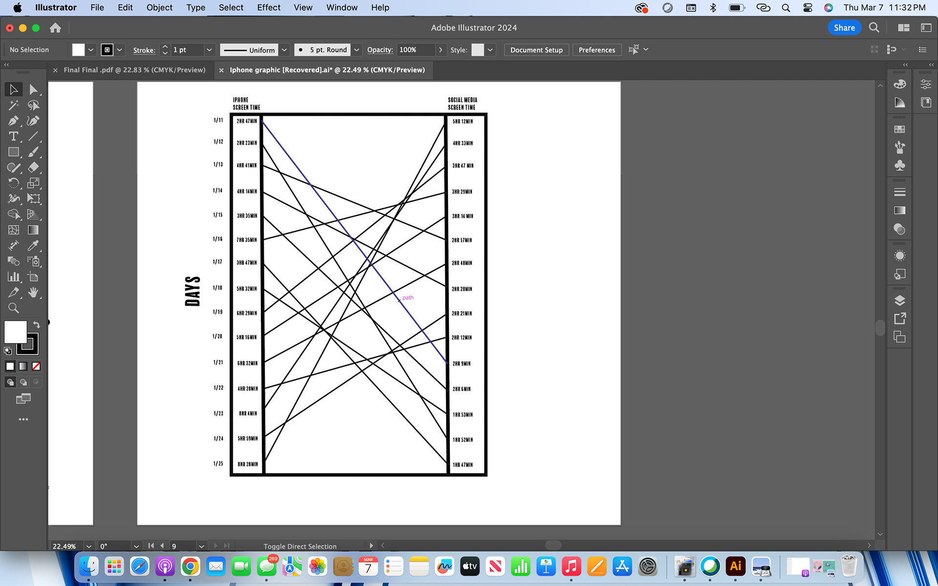
-My iPhone screen time is greater than my Mac screen time as a whole
-Social media is a fairly large portion of my total iPhone screen time
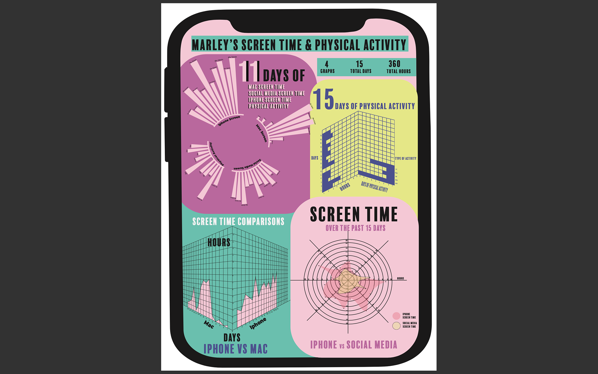
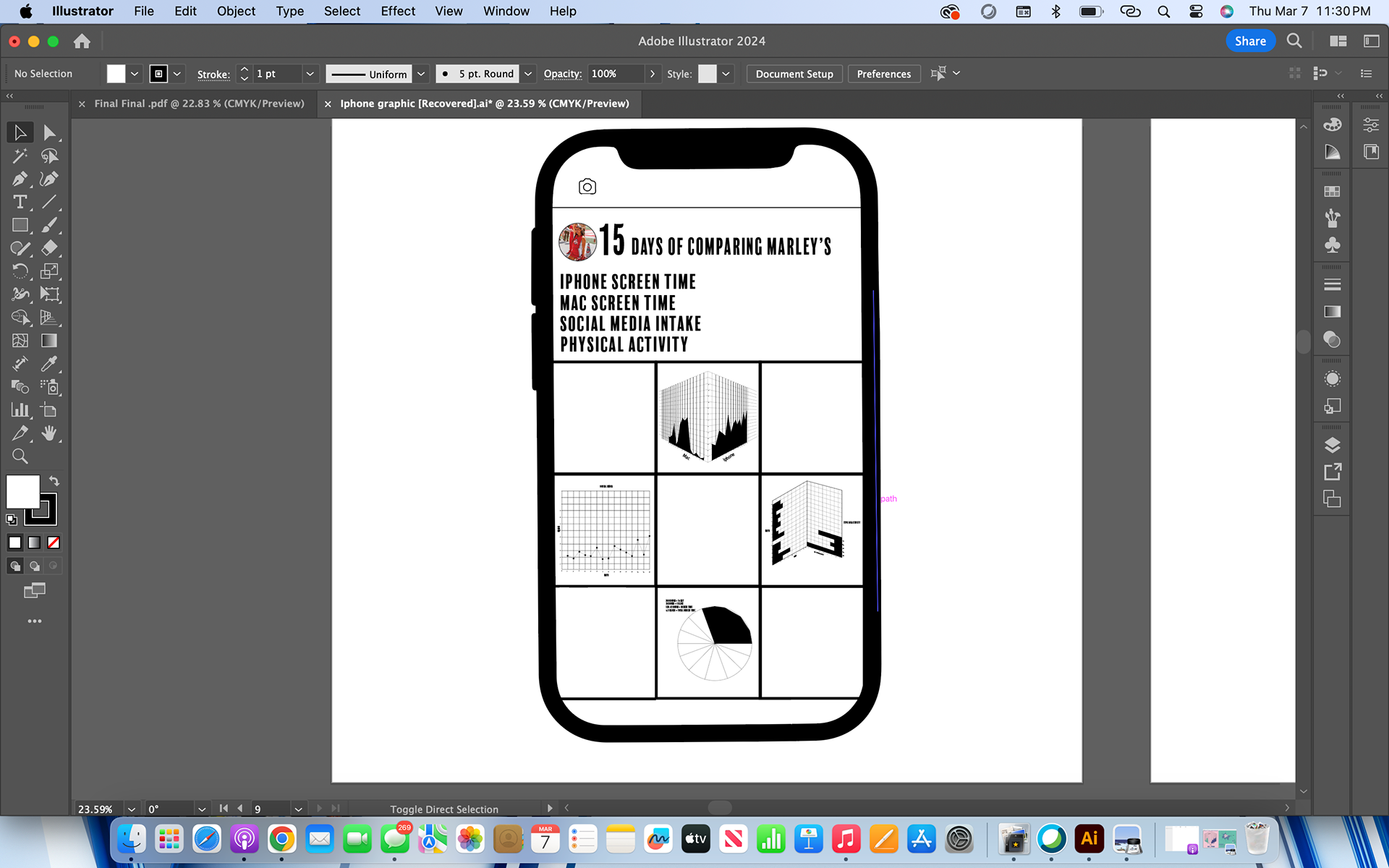
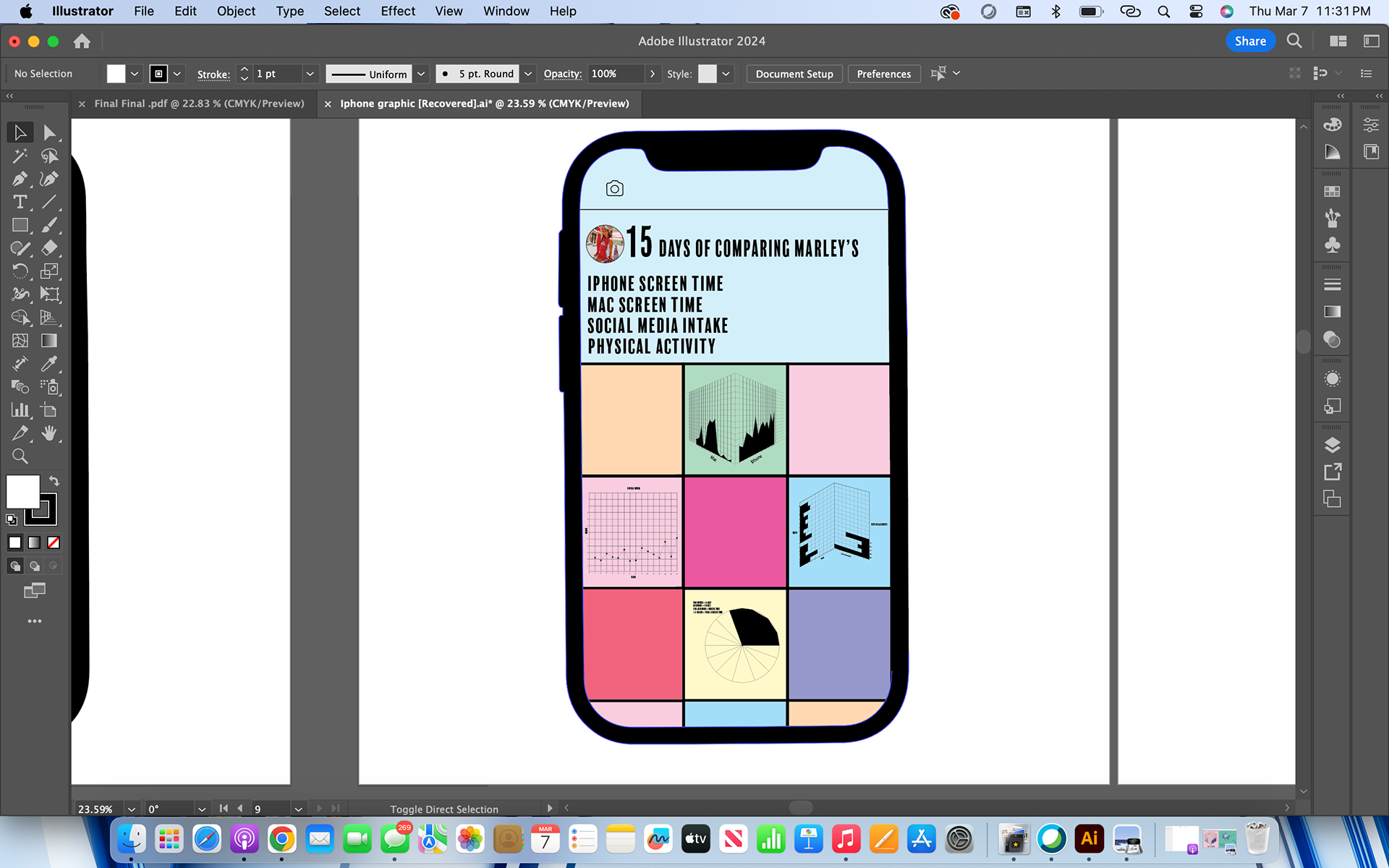
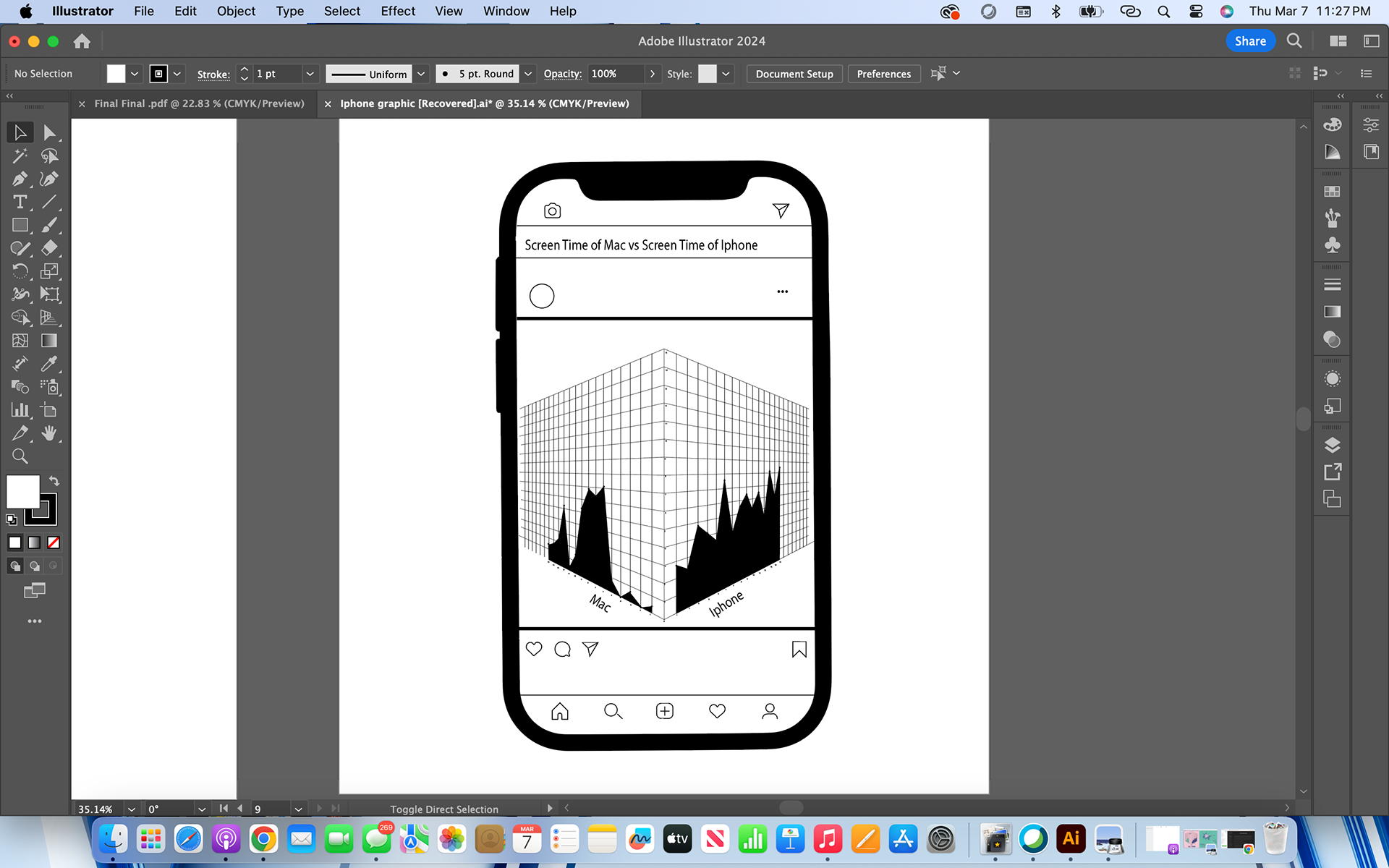
Concept Development: I wanted to originally construct my data like an Instagram post. I collected so much data and I had many different comparisons that I wanted to illustrate through my project. I chose to do a card theme which allowed me to construct different graphs and do different comparisons but also lay the cards side by side so you can still see different comparisons between the four graphs.
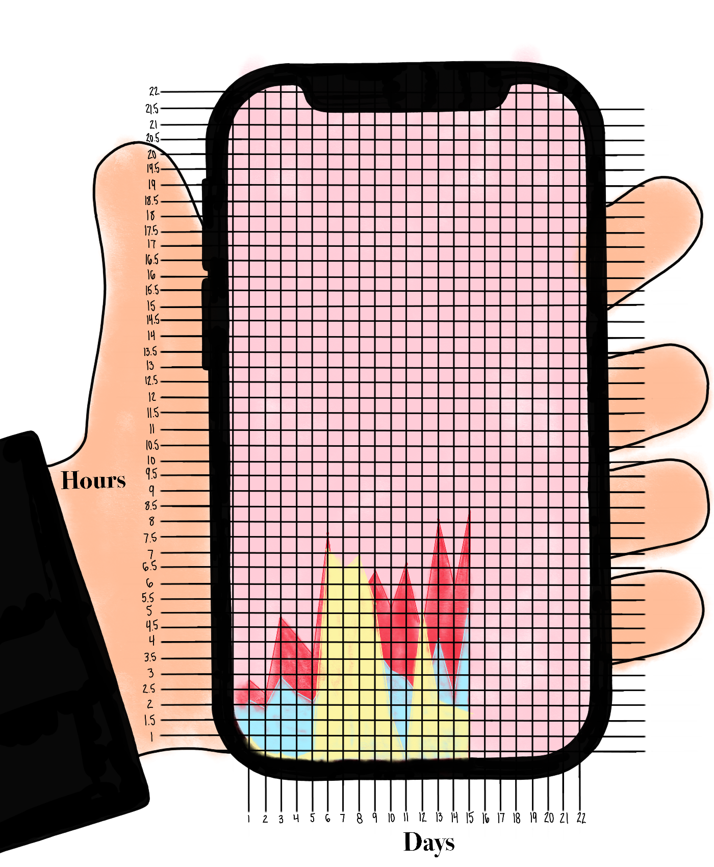
Sketches & Drafts
Iteration: For my first iterations, I struggled to find the style of the graph that I wanted and the true comparisons I wanted to show. I met with my classmates and my professor and they helped me navigate toward my style and allowed me to brainstorm different ideas to get my thoughts rolling in the right direction of what graphs were visually informative and effective. At first, I started with one graph and then I navigated to four. I thought about doing more than four but then I realized that four is all that I truly need.
Final Design
Reflection
Challenges: During this project, I struggled to find my style. I was indecisive for the first half of the project and I did not know how I wanted to visually inform my audience on the data that I collected from my everyday life. I overcame this challenge by talking to others and getting inspired by others. My classmates are great people to talk to and to bounce ideas off of. I am very much a visual learner so being able to talk about an idea and sketch it out for others helps me tremendously.
Learnings:
Future Directions: In the future, if I were to do this project again I would start to experiment with different types of graphs sooner. I found that just hand-drawing graphs and experimenting with data comparisons allowed me to find more connections in the data. It allowed me to understand the project quicker rather than designing detailed graphs from the start.
Final + iterations