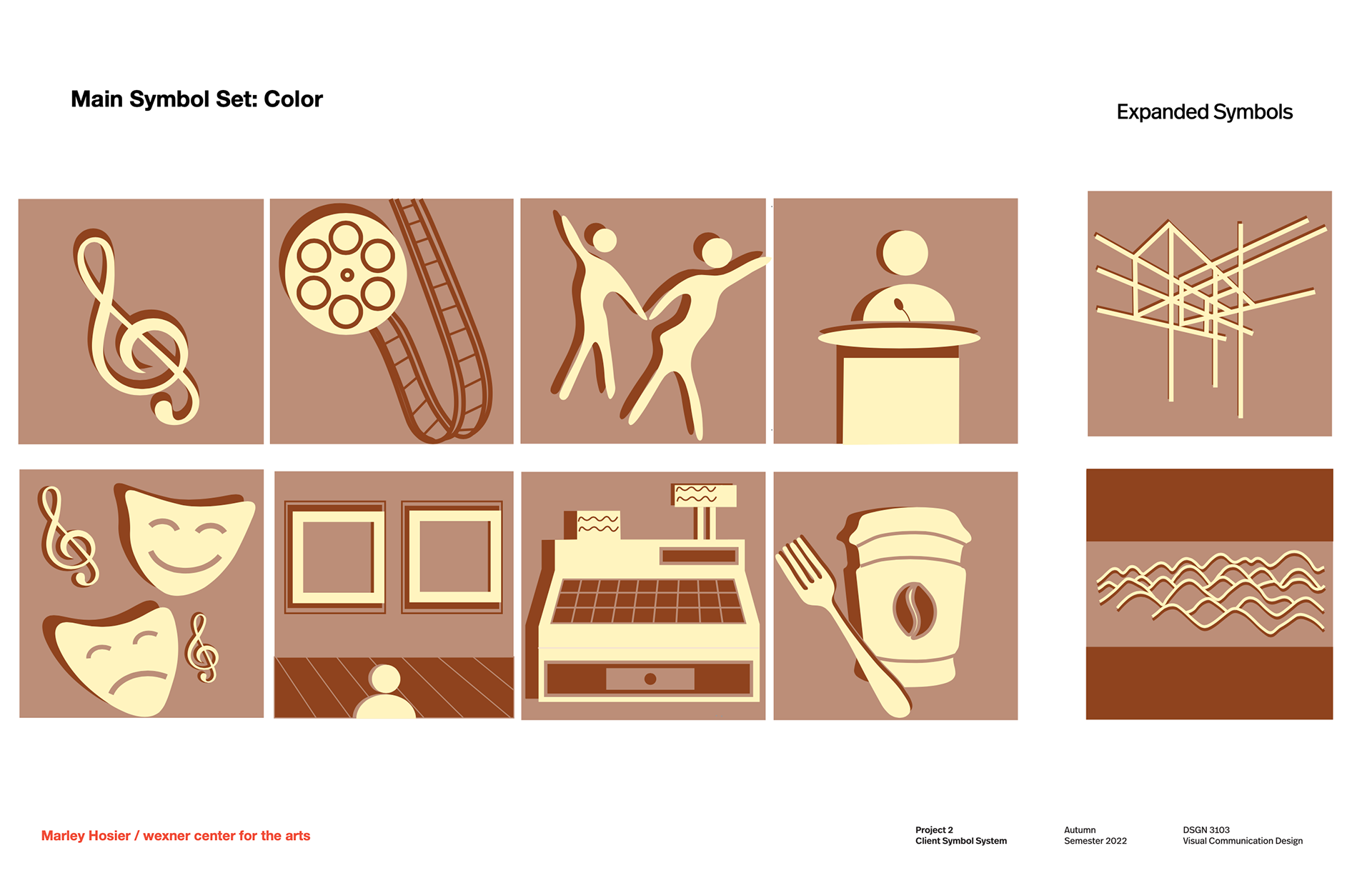
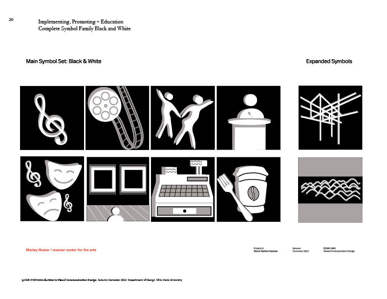
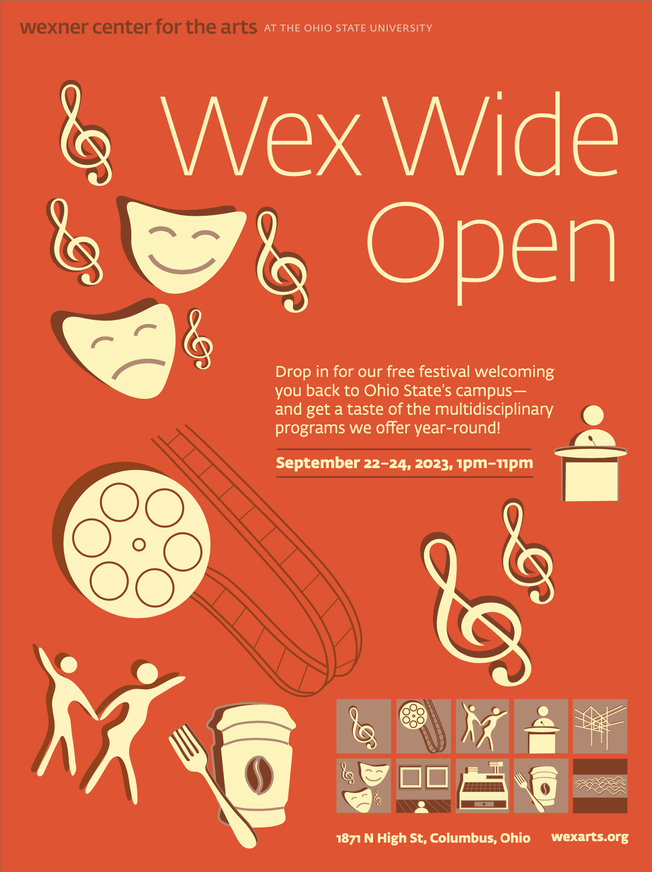
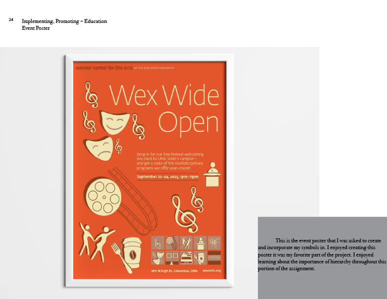
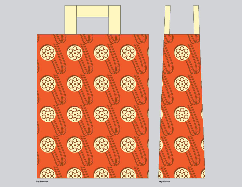
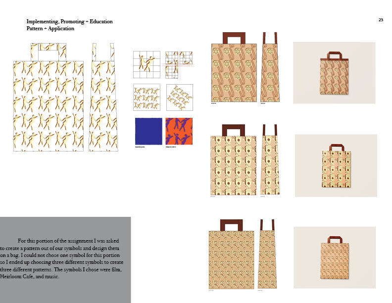
For this assignment, I was asked to create a wayfinding symbol set for The Wexner Center. I had a lot of fun with this project because it allowed me visually communicate areas of The Wexner Center to make navigating through the building easier and more convenient for visitors. I chose this color scheme because I believe it helps communicate my designs in an effective way. The colors are contrasting and work well together. In the first picture, you see my completed symbol set. In the second and third pictures, you see the poster mock-up I created for The Wexner Center. In the fourth and fifth pictures, you see my bag mock-up designs for The Wexner Center. In the last picture is my completed symbol set in black and white. Overall, I found this project to be one of my favorites thus far at The Ohio State University. It allowed me to expand my skill in Adobe Illustrator and taught me how effective wayfinding can be throughout an area.